

 We came into a dilemma over the weekend, we wanted to see if we could move the piano into a new area, so that we could get an 8 foot long dining table. We are always having friends over for meals, and the kids sit at one table, the adults at another, so it would be great if we could all sit together. Plus, we’ve been keeping our eye out for a really long farm table for awhile now, and those are hard to come by, but I think we have found one that might work.
For larger dinners, we usually bring the breakfast table over into the dining room to create a really long table, but then when people are passing by between the table and the piano, their booty ends up making music. There just isn’t space when people are sitting down, so we knew the piano would need to moved to make it a more comfortable dining area. We tried the piano in the hammock room, and the calming vibe of the hammock was clashing with the piano, so then we moved it to the back wall of the dining room. It looks okay, but the chandelier is not centered over the table anymore. I received a lot of good suggestions on Instagram the other day, so we do have a couple solutions now. The light is centered on our ceiling to floor windows, and I don’t really want to move it to be over the center, so one option is to look for another vintage chandelier to match to balance it out.
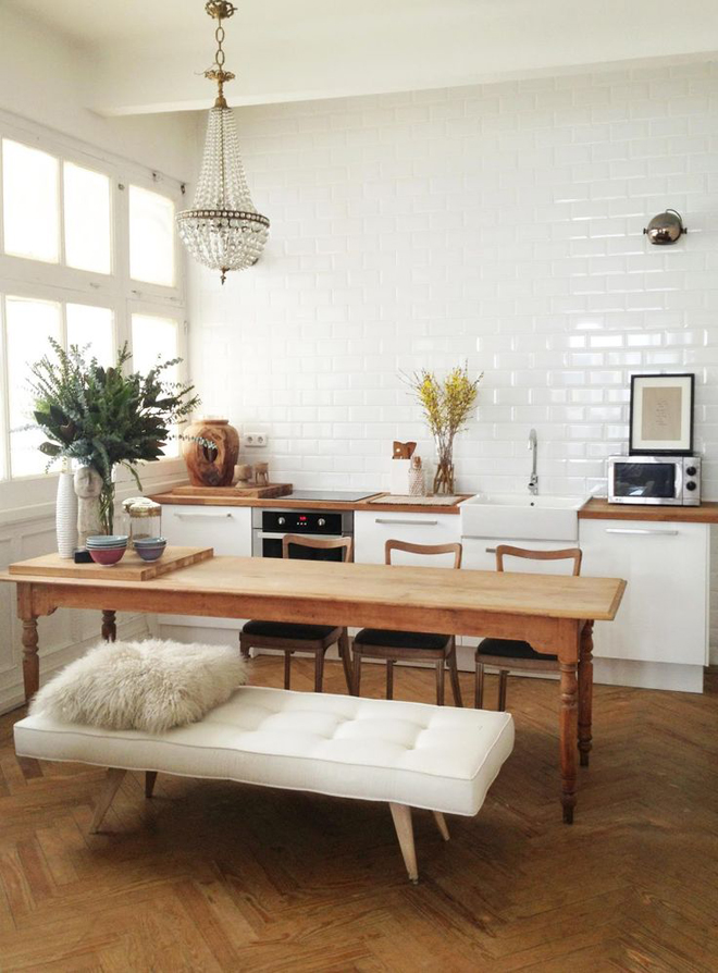
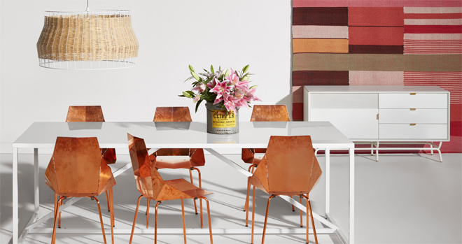
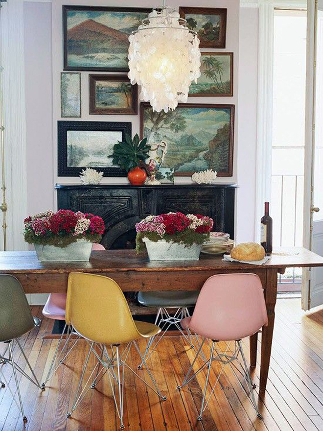
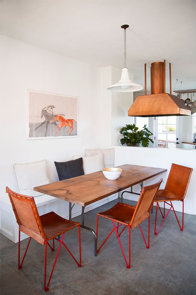
I started looking at my Pinterest “decorate” board for ideas (of course!) and saw many off-centered chandeliers, so maybe off-centered will work with our space. Then, I saw this BluDot image and now we’re thinking if we put a really large piece of art on the right side of the wall, that might provide the balance we need for the chandelier. So now, I’m kind of liking the off-centered look of it all. Plus, I used to always want to put some tall branches in a vase centered on our dining table, but the branches would hit the light. With this new set up, I can put some taller arrangements on the table and it will fit perfectly. All of the above images also reinforces that lights don’t always need to be centered over the dining table, so we will see if we can pull this off.
Would you do an off-centered chandelier or would that drive you nuts?
image 1 by las cositas de beach & eau (not sure if this is the right source, but if anyone knows the original, do share). image 2 by bludot catalog, image 3 from better homes & gardens, image 4 by brittany ambridge for domino.


Hm… that’s interesting. I think it depends on the style and proportions of the fixtures and furniture involved. I’ve wanted to move my dining room table around, but haven’t because of how the light is centered above it. The light is too big, the table too small, so it looks funny.
definitely go off-centered. when i started looking at the images, i realized that i’d seen many of them before and never noticed that the light was off-center. asymmetry has always been my preference. it feels more artistic to me. …and i love moving furniture! feels like a whole new space for a while. 🙂 have fun!